


Case study, Trueground, Soil Drilling Specialists, Fraser Valley, BC
A field brand built from the ground up
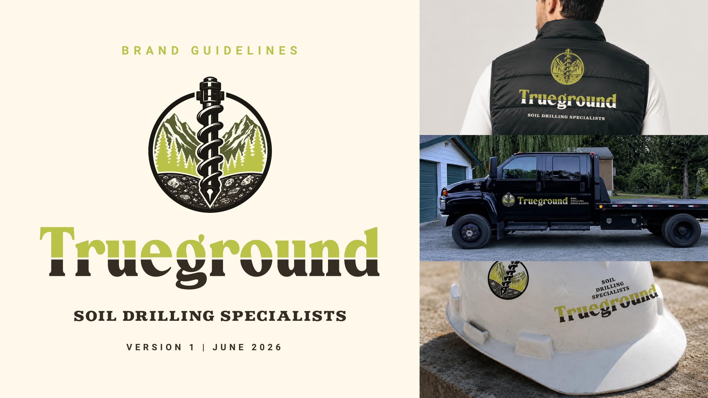
An owner-operated drilling company with real field credibility and no brand to show it. We built the whole system from scratch, logo suite, soil-and-lime palette, voice, iconography, photography direction and vehicle graphics, so Trueground looks as capable on paper as it is on site.
- Built from scratch
- V1Built from scratch
- Guidelines, plus logo & type appendices
- 47 ppGuidelines, plus logo & type appendices
- Lockups in the logo suite
- 5Lockups in the logo suite
Before
What was broken
Trueground had the thing money can't buy: accurate field data, honest timelines and crews who know the work. What it didn't have was any way to show it. No logo rules, no palette, no voice, every proposal, truck and hard hat was a fresh guess, so the company looked smaller and less established than the work it was doing for engineers, contractors and municipalities.
After
What changed
A 47-page brand system built from scratch: a drill-bit mark over mountains and trees with a five-lockup logo suite, a soil-and-vegetation palette with Field Lime as the signature accent, accessible colour pairings, a plain-spoken voice, a drill-and-strata icon family, documentary jobsite photography direction, and real applications from proposals to the truck. Which means the brand now carries the credibility the work already earned, and every vendor, sign shop and new hire produces on-brand work without a designer in the room.
The process
How it actually happened
Ground the strategy in the field
We started with who actually buys drilling: geotechnical engineers, general contractors, developers and municipal teams. Each one needs something different, accuracy, schedule safety, confidence, traceable records, so the message hierarchy ('Reliable data, grounded in experience') speaks to all four without going stiff or generic.
Draw the identity from the work
The mark combines a drill bit with the mountain landscape, and the palette, Ground Cream, Field Lime, Deep Olive, Slate Blue, Soil Brown, comes straight from field notes, vegetation and equipment. Which means the brand looks like the job sites it works on, not a generic trades template.
Make misuse impossible to miss
Clear-space rules, minimum sizes, approved backgrounds and a six-point misuse list keep the logo intact on everything from proposals to hard hats. So the identity stays sharp even when the person applying it has never opened a brand guide before.
Ship a system people can run
The guide ends with production notes, real applications and appendices of every logo, colour and type file a printer or developer could need, the right file, the first time. Which means consistency no longer depends on who happens to answer the phone.
Delivered through Founder

Sound familiar? Let's talk it through.
We'll say which parts need a person and which should run themselves.