


Case study, Addition by Redekop Ferrario Properties, Willoughby + Willowbrook, Langley
Extending a brand without breaking it
The brand guidelines existed, but the website, signage, icons and sales tools were improvising around them. We built the v2.0 system on top of what already worked: logo family, voice, photography direction, an interface kit and icon library, so every new piece stays on brand without starting over.
- Built on the existing brand
- V2.0Built on the existing brand
- Living reference, plus appendices
- 43 ppLiving reference, plus appendices
- Icon families in one line voice
- 8Icon families in one line voice
Before
What was broken
Addition, a townhome community between Willoughby and Willowbrook, already had brand guidelines: a wordmark, two typefaces, three colours. But the guidelines stopped where the real work started. The website, the sales centre, the signage and the social posts were all improvising around the edges, and every new artifact risked drifting from the last.
After
What changed
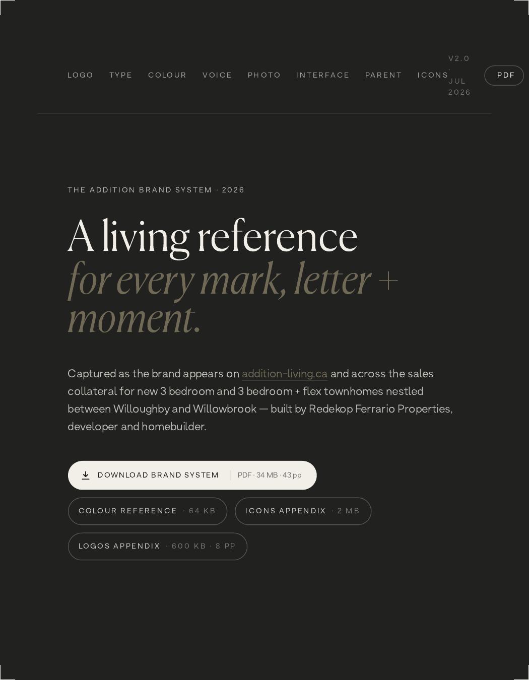
A 43-page living brand system, version 2.0, that keeps everything the original guidelines got right and extends it everywhere they were silent: a full logo family with misuse rules, an editorial type scale, colour proportions, voice and banned-words list, photography direction, a quiet interface kit, and eight icon families in one shared line style. Which means the sales team, the sign shop and the web vendor all produce work that feels like one brand, without a designer in the middle of every request.
The process
How it actually happened
Respect what already worked
We audited the existing guidelines and kept the two-tone signature, the typefaces and the palette intact. Extending instead of replacing meant the money already spent on the brand kept working, and nobody had to relearn a new look mid-launch.
Fill the gaps the original guide left
Voice, photography and interface rules didn't exist, so web and print were guessing. We wrote them, grounded, specific, quietly generous, with a banned-words list that retires 'exclusive, bespoke, curated', so every caption and brochure sounds like the same company.
Turn one glyph into a toolkit
The plus sign became the brand's connective tissue: a couplet system for headlines ('moments + memories') and a full icon library drawn in one line voice. Which means new headlines, signage and wayfinding feel native to the brand instead of bolted on.
Ship it so people actually use it
The system ships as a living PDF with separate colour, icon and logo appendices, the right file for the printer, the developer or the social team, the first time. So consistency stops depending on who happens to be in the room.
Delivered via Fifth Avenue Real Estate Marketing

Sound familiar? Let's talk it through.
We'll say which parts need a person and which should run themselves.